Crafting a Personal Brand Board
Listen up, witches–you don’t need to be a designer or marketing expert to build a killer brand board.
Brand boards set the stage for your vibe, so this exercise is all about YOU. This is where you get to weave your magic with reality, to ensure what you put out in the world truly represents your unique essence. It’s what allows your brand to become a beacon and a magnet, reaching and attracting the people who are meant to receive your spark.
The Power of a Brand Board
A brand board is your palette for crafting a personal aesthetic, a collection of elements that blend together to create a distinctive identity. It serves as your guiding star, ensuring your essence shines consistently across the digital cosmos.
In marketing, consistency is KEY. Without it, your brand loses its cohesiveness, leaving your audience puzzled about your identity and values. A consistent approach simplifies your strategy, making it more manageable to maintain your brand's integrity and effectively communicate your message.
Understanding the Brand Board Spectrum
Let's unravel the concept of a brand board and its evolution.
The Beginning: The Mood Board
Creating a mood board comes in the brainstorming phase. It's a collage of inspiration–images, textures, and colors–that kickstart your creative process. Mood boards are fluid; they morph and refine as your vision becomes clearer. This is where your brand starts taking shape, albeit in its rawest form.
The Evolution: The Brand Board
After your mood board takes a more definite form, it's time to get specific and evolve it into a brand board. You'll pinpoint exact colors, choose precise typefaces, select icons, and decide on graphic elements. Your brand board is a more refined, detailed map of your brand's aesthetic journey, offering clarity to the abstract essence captured in your mood board.
The Culmination: The Visual Identity
In marketing and branding, the most polished stage of a brand board is the 'visual identity.' It's a detailed, professionally-developed document that lays out strict guidelines of a brand's visual representation. It goes beyond basic elements like color and typography to dictate the usage of branding elements, dos and don’ts, creative instruction, and more. It's the rulebook that ensures every piece of content aligns with a brand's core identity. For your personal brand, don’t worry about making it all the way to visual identity yet–but keep it in mind for when you’re ready to turn pro!
Let’s Get Started
This article aims to guide you through the process of crafting a brand board that not only resonates with your personal essence but also provides the clarity and direction needed for your brand's development. I'll share my personal process, but remember, there's no one-size-fits-all approach. Your brand is as unique as you are, so embrace your creative freedom and let your true self guide the way.
"Celebration of You" – A Journey to Your Core Essence
Here’s an optional yet illuminating exercise I call the "Celebration of You" visualization. It’s an opportunity to tap into your intuition and unearth your truest expression before we get to business. Read the instructions first, find a meditative position, and surrender to your inner vision.
Begin by closing your eyes and imagine walking through a serene forest. Feel the presence of a mysterious calling, guiding you deeper into the woods.
In a clearing, you find a majestic tree with a door in its trunk. As you step through this doorway, you encounter a staircase. This could lead either upwards into the canopy or downwards into the roots. The choice is yours.
Visualize a majestic tree in the woods with a decorative door, just for you
Ascend or descend the stairs, and gradually become aware of a celebration happening. This is no ordinary event–it's a celebration of you, symbolizing your highest aspirations and how you wish to present yourself to the world.
Engage Your Senses:
Sight: Observe the surroundings. What does the décor look like? Notice the colors, textures, and the overall setting. Who are the guests? What time of day is it?
Sound: Tune into the sounds around you. Is there music playing? Can you hear the chatter of the guests, or perhaps the sounds of nature or a cityscape?
Smell: Inhale the scents in the air. Maybe it's the freshness of the sea, a favorite fragrance, or the aroma of delicious food.
Taste: Imagine eating and drinking at the celebration. What flavors are you experiencing?
Touch: Feel the textures of your attire and your surroundings. Perhaps you are standing on soft grass or cool marble, or feel a breeze or the warmth of a fire.
After absorbing all the details, retrace your steps back to the staircase, through the tree, and out into the forest. Open your eyes when you feel ready.
Immediately after the visualization, write down your experiences and discoveries. This exercise might reveal new aspects of your essence, offering valuable insights for your brand board.
Now that you’re grounded in your vibe, let’s carry that energy forward as we begin the brand board building process.
Step 1: Gather Inspo
Don’t hold back. Gather every image, graphic, photo that you feel really represents you. You can also explore other mood boards, color palettes, and brand examples. Personally, I like to create a Pinterest board to collect my inspiration. But you may cut things out of magazines, save images you find on social media, or play around with AI image creators. Don’t worry yet about making your collection cohesive–if it speaks to you, it counts.
Step 2: Curate Your Mood Board
Now that you’ve collected lots of inspiration, it’s time to start curating and consolidating. You may notice that certain themes begin to emerge. You may be repeatedly called to specific styles and colors. You can use whatever tool you like to help craft your mood board. I like to use PowerPoint so I can create a different aesthetic on each slide, but perhaps you like Canva or Adobe Photoshop. Start sifting and synthesizing your inspirational images into categories–eventually landing up with a collection of mood boards (or a handful of slides that each have a visual theme). Continue the process of refinement until you land on 1 mood board that gets you the most excited and will serve as the basis of your brand board.
Example of a mood board I created in the past
Step 3: Craft Your Brand Board
Now that you have a foundational mood board, you can build on top of it to define your brand. This step includes:
Composing Your Brand's Color Palette:
When it comes to choosing a color palette, aim for a balance with 3 primary colors and 2-4 secondary colors. It's essential to choose colors that resonate with you personally, yet equally important to ensure these colors harmonize well together, creating a visually appealing brand experience. You can find loads of color palette examples on Pinterest, but there are also several tools for creating your own:
Adobe Color: Great for exploring color theory and creating custom palettes.
Coolors: Offers a unique feature where you can generate a palette from an image that embodies your brand's desired colors.
Canva Color Palette Generator: User-friendly and ideal for beginners.
ColorKit: Perfect for experimenting with gradients and complex color schemes.
If you find an image that perfectly encapsulates your brand's color story, upload it to a tool like Coolors Image Picker. This will generate a harmonious palette for you. As you finalize your palette, remember to document the Hex codes for each color. Hex codes are six-digit/letter combinations preceded by '#', uniquely identifying each color. By having these codes, you can ensure consistent color usage across all your branding materials.
If you're unsure how to find Hex codes, here's a simple workaround. Add your chosen image to a program like PowerPoint, then use the eyedropper tool to pick a color directly from the image. Select "more colors" to reveal the Hex code of your selection.
Screenshot of using Coolors Image Picker to create a color palette from an image
Selecting Typefaces (Fonts):
Quick design vocab lesson! A “typeface” is a style of typography… it’s actually what we think of when we say the word “font.” In practice, “font” is more specific than typeface–it defines the size and style of the typeface (like 14pt, bold). There can be multiple fonts using the same typeface. Now–back to selection.
Typeface selection is one of the hardest aspects of design. With nearly unlimited choices and subtle cues that are more subconscious than obvious, selecting typefaces often feels like a mystery. Here’s my tip: lean on recommendations and existing pairings. Don’t try to do it all yourself! For example, if you use the program Canva, there are thousands of templates from which to choose that already have pre-selected typeface pairings for you. Typically, a brand will have 2-3 typefaces in its arsenal–a headline typeface for things like titles and page headers, a sub-headline typeface that often accompanies a headline, and a body copy typeface that is used for things like long-form copy.
If you’re new to design, I would keep it simple–pick 1 or 2 typefaces max. You can even use one typeface, but use variations of it to give yourself some flexibility. Like, BOLD CAPS for headlines, italics for subheadlines, and regular for body copy.
If you’re going for multiple typefaces, a good rule-of-thumb is to make sure you have enough distinction among them. They should be diverse, but complementary. For example, you may choose a sans-serif typeface for headlines (meaning the letters are clean and don’t have little feet coming off each letter), and a serif typeface for your body copy. Again, a quick search for “recommended font pairings” will help tremendously!
Remember, not all typefaces will be available across creative tools, so you may have to purchase or download a font to be able to use it in multiple places! Try to keep your typefaces consistent as you use different creative platforms.
Example of the type of font pairing templates available on Canva
Including Brand Elements:
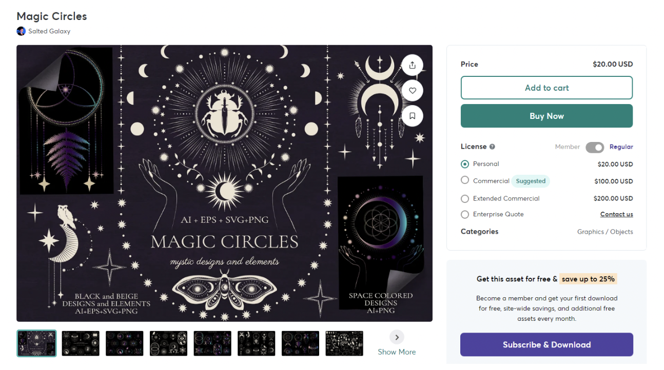
Another way to continue consistency in your brand is to use repeatable templates, icons, graphics, or other elements that give your brand a distinct look and feel. For example, this may be a specific gradient color background, or a print like tropical leaves. Again, existing resources are your friend–especially if you’re in the beginning stages of creating a brand for yourself. Once your brand is established, it may be time to invest in a graphic designer to help you hone your brand and make it even more you. But until then, check out one of my favorite websites for sourcing creative assets, Creative Market! Another great option is using the graphic elements available on Canva. Oftentimes, there are multiple elements available that fit the same style.
Example of the type of graphic pack available for purchase on Creative Market
Wrapping Up Your Brand Board Journey
To summarize, the key ingredients for your personal brand board are:
A curated collection of images to set the mood and spark visual creativity.
A palette of 4-6 specific colors that resonate with your brand's spirit.
A selection of 1-3 typefaces that communicate your brand's voice.
Supporting elements like icons, textures, and illustrations to add depth and personality.
The evolution of my moodboard into a brand board, including typefaces, colors with Hex codes, and graphic elements
Don’t worry about getting every element absolutely perfect–perfection is the enemy of progress, and it’s better to get started than to be stuck in a perpetual state of “it’s not ready!”
Do:
Embrace your uniqueness. Let your brand represent your personal magic!
Update it as you evolve. Allow your brand to be reflective of your growth.
Infuse your values. Your brand isn’t just about what you do–it’s about who you are.
Don't:
Lose yourself in trends or get overly fixated on what other people are doing.
Forget functionality. Your brand elements should work harmoniously across various platforms.
Overlook feedback. Sometimes, a fresh pair of eyes can reveal what's hidden in plain sight.
Have fun with this exercise, and most importantly, pay attention to how your brand board makes you feel. Your brand stands as a representation of you, so dial in that vibe until it feels resonant! Once your brand board feels complete, you may want to print a physical copy or keep a digital version handy so that you can use it as a guide when you’re creating content and marketing materials.
May you go forth and spread your magic with confidence! ✨
About The Author
Meet Chelsea Chung
Chelsea Chung is is our Resident Witch of Vibes and Senior Strategic Advisor at World of Women — covering branding, marketing, NFTs, and empowerment. She is based in Minneapolis, Minnesota.
Follow Chelsea on Twitter here and join our Crypto Witch Club community to connect with her and fellow Resident Witches and community members.


